




A blog feature might need a header illustration, three supporting images, and a social preview. Generating each one separately sounds straightforward until the results are placed together. One image uses warm daylight, another has dramatic shadows, and a third depicts the main object with a different shape.
The difficulty is maintaining a shared direction while allowing each image to serve a different purpose. Copying the same prompt often creates repetitive compositions, whereas rewriting everything encourages unwanted variation. A reference-based workflow, including options such as Image 2.5 API, can help establish visual continuity during image creation and editing. The process still needs a clear brief, deliberate changes, and human checks before anything is published.
Define What Must Stay Consistent
Before generating anything, write a short visual specification that applies to the whole series. Identify its audience, intended placement, illustration style, lighting, color palette, and the defining features of any recurring subject. Separate these fixed elements from details that may change, such as the camera angle, background activity, or position of supporting objects.
Consider a fictional article series about urban gardening. Its images could share muted green and terracotta colors, soft morning light, and a natural editorial photography style. One frame shows seedlings on a balcony; another focuses on hands repotting herbs. The subject changes, but viewers recognize the same visual language. If an actual product appears, list its exact shape, markings, and proportions as nonnegotiable constraints rather than relying on a general style description.
A useful specification also states what must not appear. Prohibit invented labels, unnecessary text, distorted tools, and scenery that contradicts the topic. These exclusions are particularly important for educational content, where a visually convincing but inaccurate object may mislead readers.
Build a Reusable Prompt Without Repeating Every Scene
Design each prompt in two layers: a stable section describing the overall look, followed by a variable section describing the purpose of that particular image. The stable layer might say “natural editorial photograph, soft indirect morning light, restrained green and clay palette, believable materials.” The variable layer then adds “close-up of a hand placing basil seedlings into a terracotta planter, horizontal composition, clear working surface.”
Composition deserves its own instruction because images intended for different placements need different amounts of open space. A website header may require room for a headline on the left. An instructional illustration might need the important action centered and unobstructed. Specify the aspect ratio and focal point when the chosen tool supports those controls, but assess the actual crop rather than assuming the prompt guarantees it.
Generate several distinct compositions from the same brief instead of making dozens of minor variations. Compare them side by side and select one that best expresses the project’s style. That image becomes a visual reference, not a promise that future outputs will match automatically.
Use References for Focused Changes
Reference images are most valuable when an existing subject or composition must remain recognizable. If the first gardening illustration has the right planter and lighting but a cluttered background, use it as an editing reference and describe only the required adjustment. State which elements should stay unchanged: planter shape, plant arrangement, camera position, and palette. Then request a simpler balcony background with fewer distracting objects.
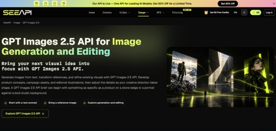
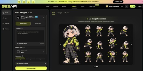
For a workflow using ChatGPT Images 2.5 API, the available page describes text and reference-image inputs, image generation, and image editing. Its Flare option is presented for general concept creation, while Sunburst emphasizes more targeted edits. Prepare the chosen image and a specific instruction, generate an updated version, then compare the original and edited images at full size. Examine whether the requested change happened without altering the protected details; the tool's description is not evidence that every edit will succeed.
Avoid combining five unrelated corrections into a single request. If you need a different background, brighter lighting, revised placement, and less clutter, change the highest-impact problem first. Preserve the strongest version after each round.
Check Consistency Across the Entire Set
Reviewing one image at a time hides problems that become obvious in a gallery. Put every candidate into a contact sheet or the actual page layout. Compare brightness, color temperature, perspective, subject proportions, and the apparent materials of repeated objects.
Then inspect each image for errors relevant to its purpose. For a tutorial, check whether hands, tools, and sequences depict a plausible action. For an article illustration, check whether the image suggests factual claims that the text does not support. For product-related visuals, verify labels, colors, dimensions, and distinctive details against approved source material. Do not publish an invented product feature simply because it looks convincing.
Finally, test the images where readers will see them. A wide image may lose its key action in a mobile crop; a pale subject may disappear against a light website background. Preview at both large and thumbnail sizes. Add accurate alternative text for informative images, and leave decorative images appropriately marked according to the publishing system.
Know When Manual Editing Is the Better Choice
Image generation is useful for exploring scenes and creating illustrative variations, but precise correction is sometimes easier in a conventional editor. If a brand mark must be letter-perfect, place approved artwork manually instead of repeatedly asking a generator to reproduce it. If the final output requires exact typography or measured diagrams, create those elements with design or diagramming software and use generated imagery only where it does not compromise accuracy.
Rights and privacy also need attention. Use reference photographs you are authorized to upload, obtain permission for identifiable people where necessary, and check the relevant service terms before commercial publication. Where disclosure is appropriate, explain the image's illustrative nature so readers understand what they are seeing.
Make the Series Feel Like One Project
Consistent AI imagery begins with a shared specification, not a magic phrase in a prompt. Define the fixed visual rules, build prompts with controlled variations, and use references when particular details need to survive a change. Review the images together, because continuity becomes visible only when the whole set is compared.
For the next project, start with just three frames: a lead image, a close-up, and a social preview. Test their crops, compare recognizable details, and revise the most noticeable mismatch. Once those three work together, extend the same process to the remaining images instead of starting every visual from scratch.

What's your reaction?
You may also like
-

How to Make a Short Business Promo Video Without Losing the Message
-
How Two People Can Compare Cities Before Turning a Move into a Compromise
-
Why Choose House Cleaners Redding CA for Your Home
-
Planning Roof Replacement Cleanup When Driveway and Yard Access Are Limited or Restricted
-
Designing Outdoor Kitchens for Food Safety, Practical Storage, and Efficient Meal Preparation
-
Bathroom Design Strategies for Better Ventilation, Humidity Control, and Moisture Protection











Comments
0 comment